
How Can I Capitalize on the Rise of Mobile-First Indexing?
Mobile-first indexing is no longer a buzzword—it’s a reality that every business with an online presence must face. But what exactly does it mean, and how can you make the most of it? In this article, we’ll dive into the nuts and bolts of mobile-first indexing and arm you with practical strategies to capitalize on this digital shift.
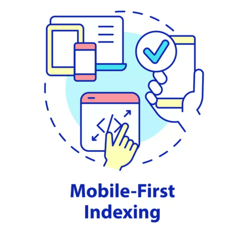
What is Mobile-First Indexing?
Mobile-first indexing means that Google predominantly uses the mobile version of the content for indexing and ranking. Historically, the index would primarily use the desktop version of a site’s content. Since mobile usage has overtaken desktop, this shift ensures that the more popular and perhaps critical format is the one that Google prioritizes.
Why is Mobile-First Indexing Important?
The importance of mobile-first indexing lies in user experience and SEO ranking. A website that is not just viewable but optimized for mobile users is likely to perform better in search engine rankings, attracting more traffic and better engagement.
Consider the following statistics to understand its impact:
- Over 50% of global web traffic comes from mobile devices.
- Google processes over 3.5 billion mobile searches per day.
- Sites that are not mobile-friendly lose out on a significant number of potential visitors.
How Do I Make My Website Mobile-Friendly?
Creating a mobile-friendly website involves several key steps. Here’s how you can ensure your site shines on mobile:
1. Responsive Web Design
Your site should be designed to automatically adjust and look good on all devices, whether it’s a desktop, tablet, or smartphone. Use CSS media queries and flexible grid layouts to achieve this.
2. Fast Loading Speed
Mobile users are often on the go, making load speed crucial. Optimize images, leverage browser caching, and minimize redirects to ensure your site loads quickly on mobile devices.
3. Easy Navigation
Ensure your site’s navigation is simple and intuitive. Menus should be easily accessible, and buttons should be large enough to be tapped easily on a small screen.
4. Optimize Content
Avoid long paragraphs and large blocks of text. Use bullet points, short sentences, and subheadings to make your content easily scannable.
How Can I Evaluate My Website for Mobile-First Indexing?
Evaluating your website for mobile-first indexing is crucial. Here are a few steps you should undertake:
1. Mobile Usability Report (Google Search Console)
Google Search Console offers a Mobile Usability report that helps you identify any issues with your site’s mobile version. Fixing these issues can significantly improve your mobile performance.
2. Mobile-Friendly Test (Google)
Google provides a free Mobile-Friendly Test tool that allows you to see how well your site performs on mobile. It gives specific recommendations for improvements.
3. Page Speed Insights
Tools like Google PageSpeed Insights not only evaluate your site’s speed but also provide suggestions for optimizations. Ensure you check both mobile and desktop tabs.
What Are Some Common Mistakes to Avoid?
Even with the best intentions, some common mistakes can hinder your mobile-first strategy. Here are pitfalls to watch out for:
1. Different Content on Desktop and Mobile
If your desktop site has rich content that your mobile site lacks, you’re undermining your mobile-first strategy. Ensure both versions have equivalent content.
2. Unplayable Content
Some media types, like Flash, don’t work on mobile devices. Always use modern, mobile-friendly formats such as HTML5.
3. Pop-Ups
Intrusive pop-ups can frustrate mobile users and affect your SEO negatively. Ensure pop-ups are easily dismissible or avoid them altogether.
4. Ignoring Local SEO
Mobile users often perform local searches. Optimize your content for local SEO, including local business listings, to attract nearby customers.
What Tools Can Help Me Optimize for Mobile-First Indexing?
Several tools can assist you in optimizing your site for mobile-first indexing:
1. Google Search Console
As mentioned earlier, Google Search Console is a comprehensive suite for monitoring your site’s search presence and fixing any mobile usability issues.
2. Google’s Mobile-Friendly Test
This tool provides a quick and easy way to check if your site is mobile-friendly and offers recommendations for improvements.
3. PageSpeed Insights
Use Google PageSpeed Insights to evaluate your site’s loading speed and gain actionable recommendations for increasing speed on mobile.
4. Lighthouse
Google Lighthouse is an open-source tool not only for performance metrics but also for accessibility, progressive web app, and SEO benchmarking on mobile devices.
How Can I Improve Mobile User Experience (UX)?
Improving the mobile user experience is foundational to capitalizing on mobile-first indexing. Here are some strategies:
1. Design with Thumb Zones in Mind
Design elements should be easily tappable with a thumb. Consider thumb zones, which are the most reachable areas on a mobile screen, and place frequently used buttons and links there.
2. Simplify Forms
Filling forms can be cumbersome on mobile devices. Simplify forms, use auto-fill options, and minimize the number of fields to enhance user convenience.
3. Use Readable Fonts
Ensure text is legible without zooming in. Avoid tiny fonts and ensure high contrast between text and background for readability.
Is Having a Mobile App Necessary?
A mobile app can enhance user experience, but it is not a substitute for a mobile-friendly website. Apps can offer more functionalities and a better immersive experience, but they require users to download them, which not everyone might do.
Focus on both: a responsive, mobile-friendly website for universal access and a mobile app for dedicated users seeking enhanced features.
What is AMP and Should I Use It?
AMP stands for Accelerated Mobile Pages, an open-source project aimed at improving web performance. It aims to speed up the loading of web pages on mobile devices by using a simplified HTML structure.
While AMP can significantly speed up your pages, ensuring they comply with Google’s mobile-first indexing and improving user experience, it also may require managing two versions of the page (AMP and non-AMP). Weigh the pros and cons before implementing.
How to Keep Up With Future Mobile-First Trends?
The digital landscape is ever-evolving, and staying informed is key to maintaining a competitive edge. Here are some tips to stay ahead:
1. Regularly Update Your Knowledge
Keep up with industry blogs, Google’s updates, and SEO forums. Regular change is the only constant in digital marketing.
2. Conduct Regular Audits
Conduct regular mobile-specific audits of your website to identify and rectify issues proactively.
3. Experiment and Adapt
Don’t be afraid to experiment with new technologies and design principles. Adapt based on user feedback and performance metrics.
Conclusion
Embracing and optimizing for mobile-first indexing is more crucial now than ever. With the majority of users accessing the internet via mobile devices, your website’s mobile performance can significantly impact its success.
By following the steps discussed—ensuring a responsive design, optimizing content and speed, and regularly evaluating your site’s performance—you can not only keep pace with the evolving digital landscape but turn it to your advantage.
Remember, the core idea is to enhance user experience. If your mobile users are happy, Google is happy. And in the digital world, that’s a win-win situation.